
Wednesday 6 April 2011
Friday 25 March 2011
Evaluation - Progression from preliminary task

As you can see to the left of my images, my first creation was a school magazine. I used very basic techniques for this such as word art for my masthead. I then used many text boxes for the text along the side and in the top right hand side. I also used very basic colours such as blue and black. I also added lots of images in random places. As you can see from my magazine on the right, i used a lot more complex text such as using a professional website to download specific text to aim towards the correct target audience. i also made more effort within the images in the music magazine. Such as downloading a photo editing programme to be able to change the image into a way that helps to represent my genre. Therefore as you can see that i made the image black and white and also highlighted the image. I then looked at other magazines that also relate to my magazine genre and found conventions to therefore add to my magazine which means that i have improved my research skills to be able to develop a better understanding of the magazine genre i am constructing. I therefore developed my layout skills as i made sure that i set out my magazine into drafts and got a basic layout before going straight into creating the magazine. I also feel that i have gained skills that mean that i am able to work out the route of the eye and be able to link the key features of the magazine to the route of the eye and work out the layout to therefore present the key elements in an orderly fashion.
I used my preliminary task to be able to improve my skills on creating a music magazine as it made me realised what is needed to make an effective magazine and also be able to add all of the relevant information. I also feel i carried out my preliminary task to be able to get an understanding of the basics of a magazine and be able to see how publisher works. Since then i have been able to alternate it to fit my music magazine and also to relate to the music genre.
Wednesday 23 March 2011
Evaluation - Technologies

I used this technique to edit all of the images for this model. I then used photo shop again to be able to edit another photo I took. This time of four girls that I used to create the fantasy of a girl band.

Contents Page
I also used Microsoft publisher to create my contents page. To start off with o added a black line dividing the title and issue number from everything else. I then added a red block from the shapes option to use for my message to the editor on the far left. I then copied my masthead from the cover and added it to the top of the page. I then made the image smaller so it did not stand out too much. I then used http://www.dafont.com/ again to find the same font I used for my feature article cover line on the cover. I then used this font to make my column headings for my contents page. This is so it linked in some ways to the cover and therefore proved a pattern.
I then added a basic font for my “THIS MONTH IN” and “WELCOME!” to make sure that it did not stand out too much but is still a relevant heading. I then began to create the columns for my contents page by clicking on text box and using a serif font to create each page which is a page number, a line and then the actual heading. I made the majority of these red and in some of the headings, I added another text box below and using a small black font in italic to use a brief summary on the more important cover lines. I used a print screen of the front cover to add under the welcome sign. I put this there in the construction to make sure that it is one of the first things that is seen and therefore can recognize the cover and remember why they bought the magazine. I then added more image of the model on the cover and the girl band to the right so it does not look too image orientated.

The first thing I did to create my two page spread is adding all three images to the top of my page and making each of the three image into the same size by changing their text wrapping and making each of the pages equal. Then I added a dark black line around each of them by editing the images and making the outline a lot darker. I then used http://www.dafont.com/ by adding the masthead name to the top left corner and making it black rather than red. I then added the long text boxes in the form of newspaper which are equal lines and then copied the text from the draft of text and then changed the colours. I changed the colours for the questions to an orange and the answers to a simple black.
The next thing I done was to create the shapes around the title and the blue box in the bottom corner. I did this by going into insert and creating a shape then rotating and filling the colour in. The next thing I did was to add the text for the name of the band which therefore I went onto http://www.dafont.com/ and downloaded the same font that was used on the feature article cover line on the front cover.
The next thing I did was to add text to the blue box in the bottom left corner and therefore I did this by adding text to the corner and changing the colour and size. The last thing I did was to add page numbers. I did this by clicking on insert and then page numbers. I then added the page numbers I wanted and clicked enter.
 I chose to edit this image in a slightly different way to black and white, therefore I made the image a lot more brighter and sharper and also added a yellow tinge to the image.
I then used another font that was more simplistic rather than all of the complicated fonts and therefore added a more simplistic way to the cover; therefore I just used a simple font off of word such as Arial. These cover lines were placed around the image so that it did not look cluttered and therefore added a formal tone to the magazine.
Evaluation - Target audiences

My magazine is aimed at teenage girl’s ages 13 - 19 and ABC1s. It is an indie/ pop magazine and will contain information that relates to this genre.
As you can see from this question that the most popular age range is 13- 18 year olds which means my target audience are teenagers. However some are older and therefore i need to make the magazine slightly adult.
 As you can see from this question that my targeted gender is mostly female but there are still male readers and therefore i needed to make the magazine slightly more female orientated.
  |
| As you can see from this question that my target audience mostly enjoy hanging with friends and listening to music and therefore i needed to add music orientated articles and also articles including friends stories. |

As you can see from this question, my target audience download music between every other day and once a week. Therefore i decided to add free download with every issue.
 |
As you can see from this question, the most popular price for magazines in a month was £0.99 to £4.99 and therefore i have to divide this number roughly by four and therefore came to an amount of £1.99 |
 |
As you can see from this question, them most popular colours were blue and red and pink and purple. Due to my feninine target audience, i chose to use a red for the cover and green for the masculinity. I then chose blue for my two page spread and the orange for femininity. |
 |
| As you can see from this question that the most popular images wanted in the magazine were famous indie bands and pop bands. I therefore included an indie lead singer on the cover and two page spread and a pop girl band on the contents page to add variety. |
Evaluation - Appeal To Target Audience
Appeal to target audience
My magazine is aimed at teenage girl’s ages 13 - 19 and ABC1s. It is an indie/ pop magazine and will contain information that relates to this genre.
 One of the things that my cover uses to appeal to the target audience of teenage girls is celebrity sex appeal. I made sure that I used an image of a male to appeal to the target audience and therefore if the teenage girls saw the image of the lead singer that they know, they will want to buy the magazine to read about him because they have a teenage crush on him. Another aspect of my front cover that appeals to the target audience is the bold text and colour scheme. I feel that due to the dark image in the background of the cover with its grey, black and whites, the colours of the cover lines and masthead needed to be bright. Therefore I feel that the red,green and gold appealed to the target audience because red is a very feminine and passionate colour which can therefore link in with the sex appeal of the main image and also can relate to the female audience. Whereas the green adds a sense if indie to it and therefore helps relate to the genre of the magazine which can then link in well with the target audience of female indie magazine lovers.
 Another aspect of the cover I feel appeals to the target audience of female indie magazine lovers is the cover lines. I made sure that I added a variety of topics to ensure that I can relate to all areas of my magazine. For example I added a cover line about Katy Perry and her ideas on fashion. I feel that this was relevant as it added femininity due to the female s

As you can see, to the left is the question of my final draft survey asking what people thought of my front cover. The most popular response was that they liked the colour scheme and how it linked in well with the genre of the magazine. The second most popular response was that the main image linked in well with the genre of the magazine. And the other popular reasons were that the cover lines were interesting and drew them in to want to read them and also that the layout was interesting and fully informative.


I feel that an aspect of my contents page that appeals to the target audience is that the colour scheme is the same as the front cover but changed over and therefore can link in well with the genre of the magazine and also give a sense of recognition when the readers go to open and read the magazine. I also made sure the colours were used for different aspects and therefore looked more colourful for example by adding more red that green and also adding black and white to add a sense of indie to therefore relate to the genre but also add a bright, feminine tone to it.
Another aspect of the contents page that is appealing to target audience is that there are more images to look at rather than being overwhelmed with information much like the cover and therefore it looks more interesting. I added an image of the main article artist and also another image of a girl band. This shows that the main article is not the only one and also to show a different side of the artist to draw the readers in to get to know. I also added an image of the girl band to add more femininity to the magazine and help advertise girl bands and a different side of the magazine rather than male, grunge, indie bands. It therefore adds a lighter note to the magazine.
Another aspect of the magazine that can appeal to the target audience is the precise headings for each area of the magazine. I feel that the clear headings make the layout of the magazine more formal and easy to understand and therefore the reader can go to the section that they most want to read first which can therefore become more appealing to them and encourage them to buy the magazine.
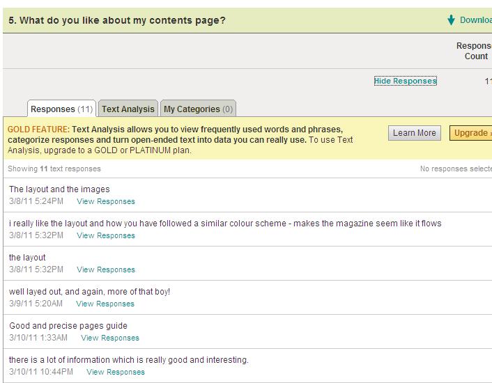
Some of the aspects of my contents page that readers liked were the layout and the images. Another popular response was that the colour scheme was the same as the cover to make it seem like it flows. Another popular response was the layout and how their was just enough information so it was interesting and not boring. Another popular response also was that it was clearly laid out with specific sections.

Some improvements that the responses said I could have made were making it more colourful and therefore more images rather than informative. Other smaller responses were to change certain things such as different fonts and different text in certain areas. Whereas the most popular response I got was to change the colour scheme and add less information.
Two Page Spread
I feel that the target audience for my magazine could find my two page spread appealing as the colour scheme, unlike the front cover and the contents page were very different. I chose a colour scheme of blue, orange and black. I chose this as I felt that I could not have the same colour scheme of red and green otherwise the magazine would just get boring and therefore I chose the orange as it is a very bright colour and therefore stands out and also comes across as very feminine. However, the dark blue and black help relate to the genre of indie and the two page spread of an indie band lead singer interview. I made sure that the text was in black to make sure that the readers paid the most attention to the images and the larger, bolder text.
 Another aspect that I feel can appeal to the target audience is the newcomers box in the bottom left hand corner. I added this in to add something different and light to read after reading the article. It is in the route of the eye line after the article and therefore once the audience has read the article, they are going to see this box and therefore want to read about the artists I included in there which are of a similar genre to the feature article. I feel that this will therefore relate to the target audience as it is the same genre as the feature article.
The most popular response of the two page spread positive aspects was the layout. The majority of the people who answered this question said that the layout was very formal and nicely placed. Another aspect was the professionalism of the spread and that is therefore very similar to the real thing. Another popular aspect was the colours as it was different and also that it was very informative but still attractive.

Some of the improvement they said I could have made was the images. Due to the fact that they are very similar, it does not make it look colourful. Also add colourful images and not just make them all black and white as it can get very boring. Another aspect that could be improved is the colours. Maybe use brighter colours as it still looks very dark, especially with the black and white images.

The pictures related to the target audience as people said in the survey that they were taken very professionally and therefore made to look professional. Also that the editing was done well to make sure that it fitted in with the genre and therefore worked well. People also liked the fact that they were edited to be in black and white as it related to the genre of the magazine. Also, the use of locations. A popular response was that the use of locations such as the school setting and the lounge setting could relate to the genre overall but each article in separate ways.
Evaluation - 1) Conventions
For my magazine I created an Indie/ pop magazine that relates to teenager girls mostly but men can also buy this magazine. The target audience for the magazine is ages 13 to 18.
Conventions
I found out that the conventions of an Indie/ pop magazine have many conventions in common. I related my magazine to magazines such as Q, NME and other magazines that have this genre because they have the same genre as my magazine. The conventions that a Indie/ pop magazine use are:
Front page:
· An ordered layout
· A main image in the middle, usually a celebrity
· Cover lines around the celebrity image relating to the genre
· Hot spots usually of the main image
· List of band names relating to the genre in the corner
· Dark colour scheme to relate to the genre
Contents page
· Ordered layout but containing lots of information
· Images of article celebrities
· Simple background
· Image of main article
· Message from the editor
· Image of front cover
Two page spread
· Multiple images of celebrity
· Other albums or artists you may like
· Simple colour scheme
· Different colour scheme to the front page and contents page
· Pull quotes and a stand first
· Name of the celebrity in the middle

Front page
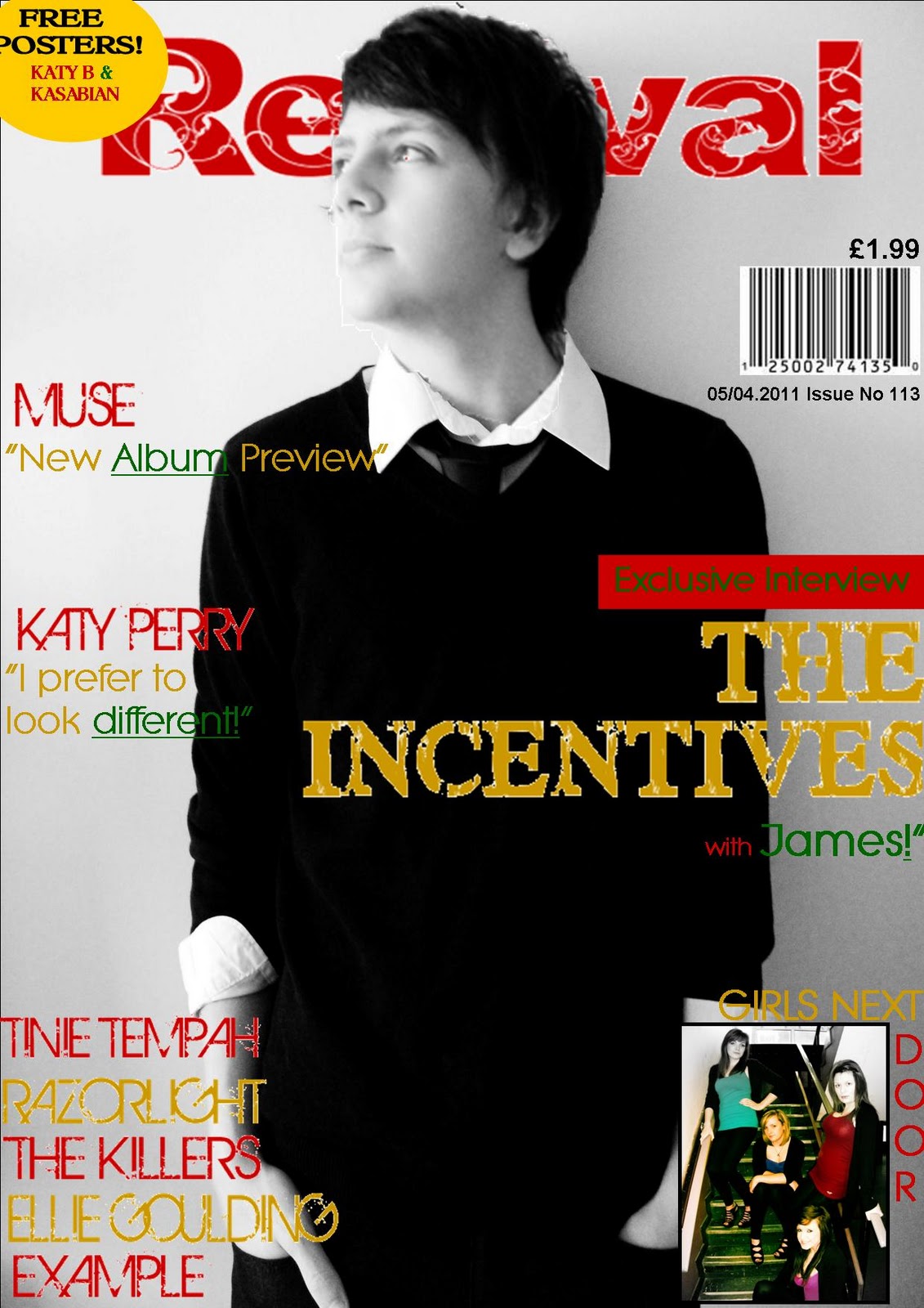
For the cover of my magazine I made sure that I used a celebrity image. This is so it means that the audience will recognise them and therefore want to buy the magazine to find out what it is saying about the celebrity that they recognise. I made sure this image was in the middle of the magazine so that it could be the first thing of the magazine that the audience sees and therefore this is likely to make them want to buy this magazine. I then made sure that the cover line that related to this image was larger than all of the other cover lines and also in a different font that made sure that it stood out. I made sure this happened so that once the target audience had seen the image, they could see the cover line next to it and be able to relate this to the image to get an taste of what the article is going to be about and therefore this will make them want to buy the magazine even more. The next thing I done was make sure that all of my cover lines related to the magazine genre of indie/ pop but also making it slightly feminine due to the fact that my target audience is more female than male. For example, “MUSE – New Album Preview” This relates to the genre as MUSE is a popular indie band. However I added more personal articles to do with the actual life of an indie/ pop artist rather than their music. Other cover lines I used were “Katy Perry – I like to make a statement.” This tells the audience that they can learn about not only music and backgrounds but also fashion and more feminine topics which mean that the target audience are likely to read this. The next thing I added was a list of band names. This helps towards the target audience as it means that they can understand what kind of artists and bands are going to be in the magazine. I added this to the bottom of the front cover as this means that it is not the most important item of the cover but it is one of the last things that is seen in the route of the eye to make sure the target audience remember what kinds of people are going to be in the magazine which will therefore make them want to buy it. I then added a pug which has an offer for free posters of other artists and bands that can relate to the genre. I added this so that the audience would get slightly more excited because they get free posters and so I made sure this is at the end of the route of the eye. Therefore it is at the bottom of the page in the right hand corner. I made this the last part to give the audience something to look forward to when buying the magazine.
Contents page

For the contents page of my magazine, I added an image of the front cover. I done this so that the audience would be able to look onto the contents page and be able to find out where in the magazine their favourite articles would be. It also means that those who look onto the contents page will be able to see this image and be able to familiarise themselves with the actual magazine. I then added a message from the editor. I found that this was very conventional in music magazines. I added this message to make the audience more comfortable with the magazine as by writing this paragraph, it makes the audience feel like the editor is actually talking to them and therefore making it seem like the magazine is made just to suit every individual. I added this to the left on the red part of the page to make it stand out against the red background and therefore it is clearly visible, however, it is not as visible as those in the centre of the page and also the images. I then added clear headings for each section. I made this font similar to the fonts on the front to be able to allow the audience to familiarise themselves with the overall style of the magazine and therefore link this to the genre. I also added these headings to be able to make it a lot simpler for the readers and also to make them able to go to the section they want to read them the most. I then added images of the main articles, I done this because it can allow the readers to be able to familiarise themselves with the main articles. For example, if the reader saw the image of the celebrity on the cover, then saw a different image of the celebrity on the contents page, it allows the reader to remember why they were going to read the magazine in the first place, this means they will not lose interest. The other image I added to show that it is not only just about this one article but that the magazine contains a wide range of articles and so I added this image at the end of the route of the eye to be able to advertise other articles and therefore as it is at the end, it will be fresh in their mind after reading the main article. I added certain headings such as “Gigs and festivals” as this means that it can relate to the genre of the magazine as indie and pop bands are most likely to perform at these kinds of events. It also gives them hope of more information and even chances to get tickets. I added the heading of REVIVAL in the same font and colour as the cover as it therefore allows the readers to again familiarise themselves with the magazine title and so they are more likely to remember the magazine due to repetition and therefore they are more likely to buy the magazine again and again.

For my two page spread I added a stand first. I added this as it meant that the reader could have a small description of the article which means that it gives the readers a taste of what is going to be in the article to make sure that they know what they are reading. I added this at the top left corner so that it is the first thing, alongside the title that is seen whilst on the route of the eye and therefore this paragraph will draw the readers in. I then added a box to the bottom left hand corner of other artists and descriptions about them which therefore relates to this article. This box is example of what the reader will also like if they like the artist in the article and so this advertises other artists that are also in this magazine or will make the readers want to continue buying this magazine to read about the new artists. Due to the fact that this box is for newcomers, it means that if they buy this magazine then they are likely to know about newcomers before the other magazines and so this also advertises the magazine. I added this in the bottom left hand corner as it is seen after the article which means that once the reader has read the article they can then see the box full of newcomers that they will also like and therefore this will make them want to read on to find out about other artists they may like. I added pull quotes on the images and in between the article to draw the reader in to therefore want to read the article. This is because if they see the pull quotes that stick out from the article they can get an insight on what will be in the article and so this will force them to want to read it to learn more. I therefore added the pull quotes in a different colour to be able to stand out against the article of just black. I also added a pull quote in the image to be able to draw the reader in whilst looking at the image. I added a mature layout of strict columns in order to be able to add a more formal tone to the article which means that it is easier to read as it does not look confusing and also it means that readers are likely to read it if they see it as formal rather than cluttered and messy which also goes along with the indie genre as most articles are not cluttered but more organised. I then made sure that the colour scheme had darkness to it even though it is targeted at mostly females; I made sure the colour scheme had an indie theme to it and so I made it a dark blue, however I added the orange to make it more feminine. I added three images in the two page spread, two of which are similar to the front page. This is because I wanted the audience to see the cover, then go to the article and see similar images to be able to recognise the celebrity and therefore want to read the article as they remember them from the cover. I then added a different image in the middle to show that they are not just from one photo shoot and also to get a different side of him.

I chose to compare the cover of my magazine to the indie magazine Q. I chose this magazine as it is most like my magazine and has the same genre. Some similarities of the magazine are that they both use similar colour schemes such as red and black. This is because the dark colours link in with the genre of the magazine and therefore can relate to a similar target audience of indie readers. It also has a main image in the centre of the magazine and as you can see both images are wearing very dark colours and therefore can also relate to the genre of the magazine and can also go together with the colour scheme of the magazine. Another similarity is that the main article has a cover line that is larger than the other cover lines and therefore stands out more. This is used to be able to draw the readers in by being able to see the cover line of the main image before the others and therefore if they see the main image and then the cover line about one of their favourite artists they will want to buy the magazine to read this article. Some differences about the magazine covers are that I decided to use more cover lines. Another similarity between the two magazines is that they both went for a simplistic and more formal layout rather than cluttered. Therefore they both contain less cover lines and more images and larger text rather than more cover lines and less images. Another difference between the two magazines is that whereas my magazine has only two images, one large and one small, Q focuses on more images and fewer text whereas i used more text and only two images.

For my contents page of my magazine I compared it to Q magazine contents page. Some similarities between the two are that they both involve an image of one of the main articles. However this image is different to the one of the cover. Another similarity is that the article names and numbers have the same colour schemes as the cover which helps to show recognition of the magazine style and genre. They also have headings for each section of the page for example, features, reviews and regulars. Some differences of the two contents pages are that I added an image of the front cover in the contents page and this is also to show recognition. However Q magazine added a larger image of the main article band rather than adding lots of little images. Therefore they focused more on imagery rather than information and I added more information and cover lines rather than images.

For my two page spread I also compared my magazine to Q. Some similarities of the two magazines are that they both use images of the celebrity. These images are both very large. However Q have again focused more on imagery rather than information and dedicated a whole page just to one image. Rather than on my article, I added a few smaller images and therefore focused more on text. A similarity of the magazine two page spreads are that they both used a kicker to therefore get the readers interested in starting to read the article. Whereas the colour scheme of Q is the same throughout a lot of the magazine articles, for example red and black, I chose to add a different colour scheme for my two page spread, for example blue, orange and white. I made sure this was a different colour scheme to show a different side of the magazine and also simply to make a change. Rather than Q likes to add a regular scheme throughout the whole of the magazine. Another similarity of the magazine is that they both have a much organised layout rather than being cluttered. This is because it needs to be able to draw the right kind of readers in.
Subscribe to:
Posts (Atom)