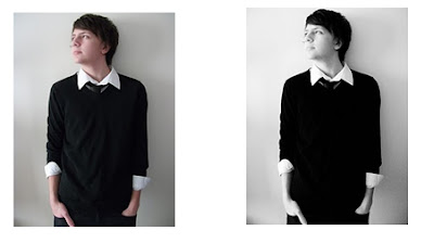
 For the technologies it took to produce my magazine, I used a lot of camerawork. For example I used my camera to take pictures that I then used for my front cover, contents page and two page spread. I used a long shot of the model to use on my front cover to make sure the audience could see a large part of the model and therefore make their own judgments by getting to se what they are wearing and how they are standing whilst also seeing their facial expression. The image below to the left is the image I chose for my front cover. I then used a photo shop 30 day trial to edit this image. Making it turn into the image below to the right. The image on the right I edited using a colour called yellow screen: black and white. This meant that not only did it make the image black and white but it made it more sharper and brighter.
I used this technique to edit all of the images for this model. I then used photo shop again to be able to edit another photo I took. This time of four girls that I used to create the fantasy of a girl band.
Contents Page
I also used Microsoft publisher to create my contents page. To start off with o added a black line dividing the title and issue number from everything else. I then added a red block from the shapes option to use for my message to the editor on the far left. I then copied my masthead from the cover and added it to the top of the page. I then made the image smaller so it did not stand out too much. I then used http://www.dafont.com/ again to find the same font I used for my feature article cover line on the cover. I then used this font to make my column headings for my contents page. This is so it linked in some ways to the cover and therefore proved a pattern.
I then added a basic font for my “THIS MONTH IN” and “WELCOME!” to make sure that it did not stand out too much but is still a relevant heading. I then began to create the columns for my contents page by clicking on text box and using a serif font to create each page which is a page number, a line and then the actual heading. I made the majority of these red and in some of the headings, I added another text box below and using a small black font in italic to use a brief summary on the more important cover lines. I used a print screen of the front cover to add under the welcome sign. I put this there in the construction to make sure that it is one of the first things that is seen and therefore can recognize the cover and remember why they bought the magazine. I then added more image of the model on the cover and the girl band to the right so it does not look too image orientated.
The first thing I did to create my two page spread is adding all three images to the top of my page and making each of the three image into the same size by changing their text wrapping and making each of the pages equal. Then I added a dark black line around each of them by editing the images and making the outline a lot darker. I then used http://www.dafont.com/ by adding the masthead name to the top left corner and making it black rather than red. I then added the long text boxes in the form of newspaper which are equal lines and then copied the text from the draft of text and then changed the colours. I changed the colours for the questions to an orange and the answers to a simple black.
The next thing I done was to create the shapes around the title and the blue box in the bottom corner. I did this by going into insert and creating a shape then rotating and filling the colour in. The next thing I did was to add the text for the name of the band which therefore I went onto http://www.dafont.com/ and downloaded the same font that was used on the feature article cover line on the front cover.
The next thing I did was to add text to the blue box in the bottom left corner and therefore I did this by adding text to the corner and changing the colour and size. The last thing I did was to add page numbers. I did this by clicking on insert and then page numbers. I then added the page numbers I wanted and clicked enter.
 I chose to edit this image in a slightly different way to black and white, therefore I made the image a lot more brighter and sharper and also added a yellow tinge to the image.
  The next step I took was to create the cover lines. I clicked on the main image and took it to the back so that it was behind all of the text. I then downloaded a different font to the masthead to use for the cover lines, “MUSE, KATY PERRY and EXAMPLE VS PRO GREEN.” I did this so that it would show a variety in the way that the layour was set out and to relate to the variety in the genres and stories in the magazine. However, for the feature article cover line, I downloaded a different font that was less fancy and decorative and more edgy and indie. This font therefore stood out from all of the others as it was different and therefore the audience could tell that this article and cover line was important and also that they could determine that the article was going to be very grunge and indie.
 I then used another font that was more simplistic rather than all of the complicated fonts and therefore added a more simplistic way to the cover; therefore I just used a simple font off of word such as Arial. These cover lines were placed around the image so that it did not look cluttered and therefore added a formal tone to the magazine.


No comments:
Post a Comment