Appeal to target audience
My magazine is aimed at teenage girl’s ages 13 - 19 and ABC1s. It is an indie/ pop magazine and will contain information that relates to this genre.
 One of the things that my cover uses to appeal to the target audience of teenage girls is celebrity sex appeal. I made sure that I used an image of a male to appeal to the target audience and therefore if the teenage girls saw the image of the lead singer that they know, they will want to buy the magazine to read about him because they have a teenage crush on him. Another aspect of my front cover that appeals to the target audience is the bold text and colour scheme. I feel that due to the dark image in the background of the cover with its grey, black and whites, the colours of the cover lines and masthead needed to be bright. Therefore I feel that the red,green and gold appealed to the target audience because red is a very feminine and passionate colour which can therefore link in with the sex appeal of the main image and also can relate to the female audience. Whereas the green adds a sense if indie to it and therefore helps relate to the genre of the magazine which can then link in well with the target audience of female indie magazine lovers.
 Another aspect of the cover I feel appeals to the target audience of female indie magazine lovers is the cover lines. I made sure that I added a variety of topics to ensure that I can relate to all areas of my magazine. For example I added a cover line about Katy Perry and her ideas on fashion. I feel that this was relevant as it added femininity due to the female s

As you can see, to the left is the question of my final draft survey asking what people thought of my front cover. The most popular response was that they liked the colour scheme and how it linked in well with the genre of the magazine. The second most popular response was that the main image linked in well with the genre of the magazine. And the other popular reasons were that the cover lines were interesting and drew them in to want to read them and also that the layout was interesting and fully informative.


I feel that an aspect of my contents page that appeals to the target audience is that the colour scheme is the same as the front cover but changed over and therefore can link in well with the genre of the magazine and also give a sense of recognition when the readers go to open and read the magazine. I also made sure the colours were used for different aspects and therefore looked more colourful for example by adding more red that green and also adding black and white to add a sense of indie to therefore relate to the genre but also add a bright, feminine tone to it.
Another aspect of the contents page that is appealing to target audience is that there are more images to look at rather than being overwhelmed with information much like the cover and therefore it looks more interesting. I added an image of the main article artist and also another image of a girl band. This shows that the main article is not the only one and also to show a different side of the artist to draw the readers in to get to know. I also added an image of the girl band to add more femininity to the magazine and help advertise girl bands and a different side of the magazine rather than male, grunge, indie bands. It therefore adds a lighter note to the magazine.
Another aspect of the magazine that can appeal to the target audience is the precise headings for each area of the magazine. I feel that the clear headings make the layout of the magazine more formal and easy to understand and therefore the reader can go to the section that they most want to read first which can therefore become more appealing to them and encourage them to buy the magazine.
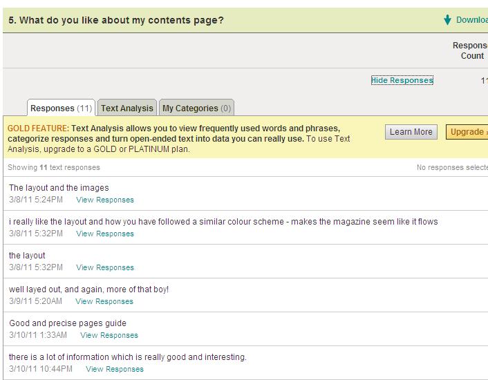
Some of the aspects of my contents page that readers liked were the layout and the images. Another popular response was that the colour scheme was the same as the cover to make it seem like it flows. Another popular response was the layout and how their was just enough information so it was interesting and not boring. Another popular response also was that it was clearly laid out with specific sections.

Some improvements that the responses said I could have made were making it more colourful and therefore more images rather than informative. Other smaller responses were to change certain things such as different fonts and different text in certain areas. Whereas the most popular response I got was to change the colour scheme and add less information.
Two Page Spread
I feel that the target audience for my magazine could find my two page spread appealing as the colour scheme, unlike the front cover and the contents page were very different. I chose a colour scheme of blue, orange and black. I chose this as I felt that I could not have the same colour scheme of red and green otherwise the magazine would just get boring and therefore I chose the orange as it is a very bright colour and therefore stands out and also comes across as very feminine. However, the dark blue and black help relate to the genre of indie and the two page spread of an indie band lead singer interview. I made sure that the text was in black to make sure that the readers paid the most attention to the images and the larger, bolder text.
 Another aspect that I feel can appeal to the target audience is the newcomers box in the bottom left hand corner. I added this in to add something different and light to read after reading the article. It is in the route of the eye line after the article and therefore once the audience has read the article, they are going to see this box and therefore want to read about the artists I included in there which are of a similar genre to the feature article. I feel that this will therefore relate to the target audience as it is the same genre as the feature article.
The most popular response of the two page spread positive aspects was the layout. The majority of the people who answered this question said that the layout was very formal and nicely placed. Another aspect was the professionalism of the spread and that is therefore very similar to the real thing. Another popular aspect was the colours as it was different and also that it was very informative but still attractive.

Some of the improvement they said I could have made was the images. Due to the fact that they are very similar, it does not make it look colourful. Also add colourful images and not just make them all black and white as it can get very boring. Another aspect that could be improved is the colours. Maybe use brighter colours as it still looks very dark, especially with the black and white images.

The pictures related to the target audience as people said in the survey that they were taken very professionally and therefore made to look professional. Also that the editing was done well to make sure that it fitted in with the genre and therefore worked well. People also liked the fact that they were edited to be in black and white as it related to the genre of the magazine. Also, the use of locations. A popular response was that the use of locations such as the school setting and the lounge setting could relate to the genre overall but each article in separate ways.
No comments:
Post a Comment